Rent2Ride

UX Design Process
Design Strategy
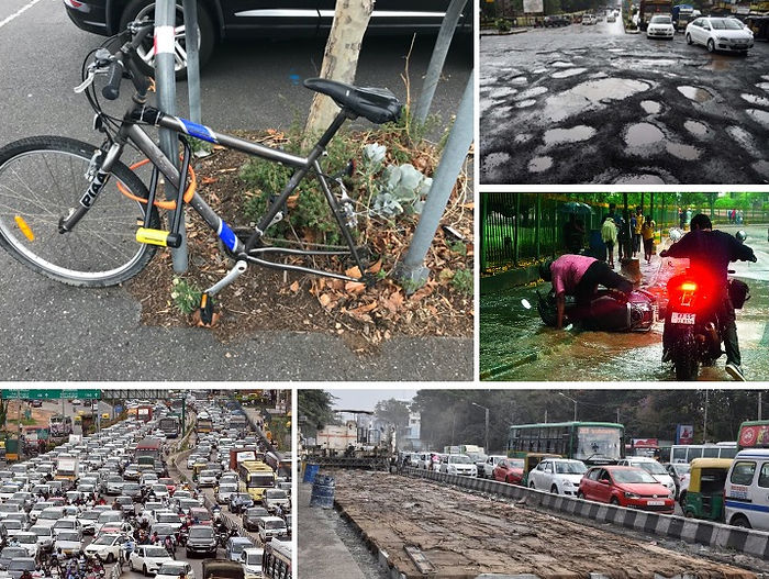
In Bangalore, traffic takes a toll on daily commute. Going from one destination toanother, becomes a major constraint. To differentiate myself in an already mature and competitive market, I needed to define a desirable role on how the app would meet the needs of the users.
‘Rent 2 Ride’ is an initiative which provides an affordable, sustainable and environmentally effective & friendly transport network in Bangalore.
Scope
To make travelling easy, pocket friendly & fun. ‘Rent 2 Ride’ is an initiative which provides an affordable & personalized transport network. Since traffic is the major concern in Bangalore, this app was made to meet the needs of the users & also to design their travelling solutions right at their doorstep.

Ideate


Questions & Survey
1.Why do you use rental bike/cycle service?
2.What is the main purpose? is it serving the purpose?
3.Which apps are you using to book a ride?
4.Can you tell me what you like & dislike about the app?
5.Is the cycle/bike rental helping you?
6.What problem are you facing on the road? Name a few problems which are yet to be addressed?
7.What more do you expect from these apps? Any specific feature?
8.Can you state few hindrances in traffic you can think off?
9.What according to you can be done to rectify this?
10.Any suggestions to make travelling easier?
11.Does it save your time & money?
12.Do you prefer taking any specific route or do you travel as per the Google maps?
13.For how long are you using this facility? Would you recommend it to your friends?
14.What does 'Ride' mean to you?
15.Motivations à reasons for cycling??
Holistic Approach
Users
-
Despite both a cost and time saving benefit, people will take the path of least resistance. They will do this in order to avoid the stress or confusion of having to figure out a new system.
-
Users don’t have the confidence and knowledge to navigate Bangalore busy streets.
-
Hidden costs? Takes most of them off guard.
-
Leaving a bike outdoors exposed it to theft and vandalism
-
City Bike Hacks?? This is quite common in Bangalore (hotspots that indicated areas that were more prone to theft and vandalism, and areas that seem safer as per the community’s experience.)
-
Heavy Traffic – Waste of time!
-
White Topping
-
Road Closures
-
One Ways
-
Accidents
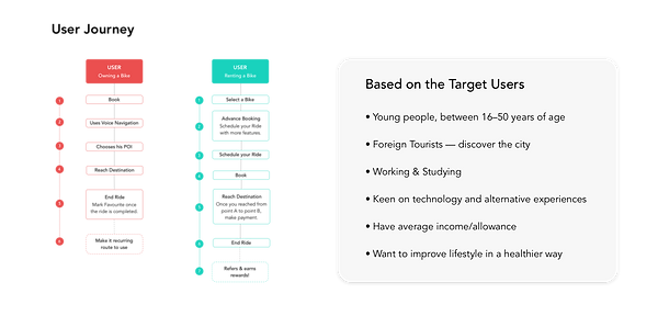
Target users : Age group between 16–50 years of age
• Foreign Tourists — discover the city
• Fun & Activities
• Working People
• Students, College goers
• Tech Savvy
• Have average income/allowance
• Want to improve lifestyle in a healthier way
• Fitness Freaks
• Strong and Fearless
• Interested but Concerned
Meeting with target audiences helped me to understand their commute challenges. I identified risks & aligned on expectations & constructed a vision for the app. Following this, I crafted an experience strategy outlining my approach and direction for the app.
Key takeaways :
1. Optimize My Commute
2. Evade Traffic in the City Center
3. Explore & Discover the city
4. A new & healthy approach
Lean UX
A collaborative lean UX approach conceptualized by ‘Think.Make.Check’, process. This sparked tons of great ideas across different disciplines.
I began the process by extracting requirements from users' mental models & observing various things people do before, during & after riding. Extracting Requirements by talking to users and observing their behaviour. This allowed me to produce a broad set of tasks quickly along with various hypothesis.
Personas
• Who likes the idea of biking for fitness but is scared of riding in the city.
• Who would like to save money
• Our tourist who likes riding around the city but would want to see some of the places while at it and not just get from A to B but also get from A to D, via B & C.
• Wanted to receive rewards for their time and participation

After designating persona types & aligning this with my phasing strategy I was able to prioritize goals in the early stages. I used personas constantly throughout the project to guide design decisions & priorities.


Extracting Requirements with Mental Models
-
Joe Checks his local dock for bike availability.
-
Joe’s local dock is empty, so he decides to check the next closest dock for bikes. He looks for walking directions to the dock & picks up the bike.
-
Joe is considering changing the normal cycling route in favor of a less-busy more comfortable route.
-
Joe’s goals are to save time on his daily commute & travel in a reliable route.
The Requirement
Minimalistic approach helped me to understand the importance of aesthetics and tone of voice to the experience. Storytelling About Ideal Experiences Knowing who exactly I was designing for allowed me to ask myself how the app fits into the lives of the users.
User Journeys
Information Architecture

Wireframes
Design Direction
I took the minimalist approach to defining the overall structure of the experience. Sketching and storyboarding, I generated stacks of ideas about the arrangement of UI, functional and data elements, and interactive behaviours. My vision began evolving into a tangible anatomy of an app.

Minimize Approach = Less Learning + More Adaptation
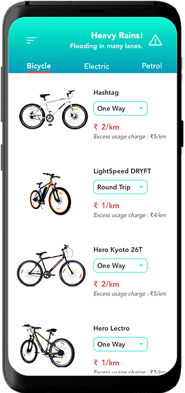
Primarily designed to support people on-the-go, users can depend on their prior experience with Google Maps and existing iOS design conventions to help them learn to use the app. The main screen has been designed to allow users quick access to primary functions of the application.
Visual Treatments - Android


Visual Treatments - Smart Watch


Tools Stack
